ProNextJS
    lesson

    Intro to Meta's StyleX

    Jack HerringtonJack Herrington

    If you're working at a large company or on an open-source project that requires strict control over CSS styles and their extensibility, the StyleX library from Meta that might be a good choice for you.

    StyleX provides a more rigid approach compared to CSS modules and Tailwind, but it can be beneficial when you need well-defined and locked-in styles. Let's apply StyleX to our current unstyled application.

    Installation and Configuration

    StyleX has installation instructions for Next.js in the docs that will always be up to date, but we'll run through them here as well.

    The first step is to install dependencies. The @stylexjs/open-props and @stylexjs/stylex packages are required for the application, and we'll also add some dev dependencies:

    pnpm add @stylexjs/open-props @stylexjs/stylex
    pnpm add -D rimraf @stylexjs/babel-plugin @stylexjs/eslint-plugin @stylexjs/nextjs-plugin
    

    This will create some new configuration files in our project.

    Babel Setup

    StyleX is developed as a compiler extension, which is configured via the .bablerc.js file. The Next.js Babel presets will still be in place, but we'll add the StyleX Babel plugin on top of it. This will switch the compilation from the faster SWC to the slightly slower Babel because SWC cannot handle JavaScript plugins.

    Here's how it looks:

    // inside .babelrc.js
    module.exports = {
      presets: ["next/babel"],
      plugins: [
        [
          "@stylexjs/babel-plugin",
          {
            dev: process.env.NODE_ENV === "development",
            test: process.env.NODE_ENV === "test",
            runtimeInjection: false,
            genConditionalClasses: true,
            treeshakeCompensation: true,
            unstable_moduleResolution: {
              type: "commonJS",
              rootDir: __dirname,
            },
          },
        ],
      ],
    };
    

    ESLint Configuration

    The ESLint configuration makes it so StyleX extensions without freaking out. The configuration file will also be changed from JSON to JS format:

    // inside .eslintrc.js
    
    module.exports = {
      extends: "next/core-web-vitals",
      plugins: ["@stylexjs"],
      rules: {
        // The Eslint rule still needs work, but you can
        // enable it to test things out.
        "@stylexjs/valid-styles": "error",
      },
    };
    

    Next.js Configuration

    As of this recording, the NextJS installation instructions use JS for the configuration. However, an App Router application gives an MJS (ModuleJS) config. Inside of the next.config.mjs file, we need to import the StyleX plugin and export its output by default:

    // inside next.config.mjs
    
    /** @type {import('next').NextConfig} */
    import stylexPlugin from "@stylexjs/nextjs-plugin";
    
    const nextConfig = {
      transpilePackages: ["@stylexjs/open-props"],
    };
    
    const __dirname = new URL(".", import.meta.url).pathname;
    export default stylexPlugin({
      rootDir: __dirname,
    })(nextConfig);
    

    Now that the setup is complete, let's start styling our application with StyleX.

    Styling the Application

    The first thing we'll do is set up a CSS reset in the globals.css file. This will ensure that we start from a clean slate:

    /* inside globals.css */
    * {
      box-sizing: border-box;
      padding: 0;
      margin: 0;
    }
    

    We can now import globals.css and stylex into the layout.tsx file:

    // inside layout.tsx
    import * as stylex from "@stylexjs/stylex";
    
    import "./globals.css";
    

    Now we can move on to adding light and dark mode.

    Light and Dark Mode

    At the bottom of layout.tsx, we'll establish styles using StyleX. We'll set up classes for html and reset, where the html class will define the default light mode styles with an option for dark mode and the reset class will reset the default styles:

    const DARK = "@media (prefers-color-scheme: dark)";
    
    const styles = stylex.create({
      html: {
        fontFamily: "system-ui, sans-serif",
        backgroundColor: "white",
        color: "black",
        [DARK]: {
          backgroundColor: "black",
          color: "white",
        },
      },
      reset: {
        minHeight: "100%",
        margin: 0,
        padding: 0,
      },
    });
    

    The [DARK] syntax acts as a media query that applies the dark mode styles when the user prefers a dark color scheme.

    Styles are then added as props on the tags by spreading the stylex.props function:

    // inside layout.tsx
    export default function RootLayout({
      children,
    }: {
      children: React.ReactNode;
    }) {
      return (
        <html {...stylex.props(styles.html, styles.reset)} lang="en">
          <body {...stylex.props(styles.reset)}>{children}</body>
        </html>
      );
    }
    

    The stylex.props function injects the class names into the tags, allowing StyleX to have both class name and style output.

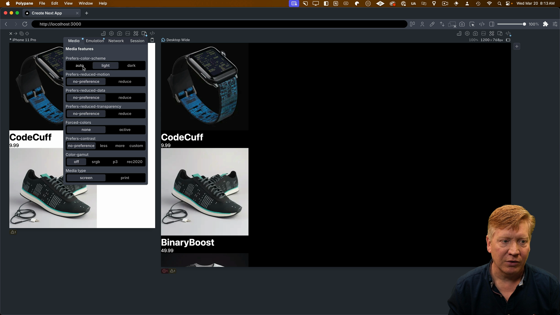
    Previewing our changes in Polypane, we can see that the light and dark mode styles are applied correctly:

    dark mode is working

    Apply Styles to the Home Component

    Over in the page.tsx file, your task is to import StyleX and set up styling using the styles provided here:

    const MOBILE = "@media screen and (max-width: 768px)";
    
    const s = stylex.create({
      main: {
        margin: "0 auto",
        maxWidth: 960,
        fontFamily: "sans-serif",
        display: "flex",
        flexWrap: "wrap",
      },
      card: {
        padding: "0.2rem",
        width: {
          default: "33%",
          [MOBILE]: "100%",
        },
        maxWidth: {
          default: "33%",
          [MOBILE]: "100%",
        },
      },
    });
    

    Apply these styles to the <main> and <div key={product.id}> tags.

    In the next lesson, we'll complete the example and see how everything comes together with StyleX.

    Transcript

    If you're working at a very large company or working on an open source project where you want the styles to be well locked in and defined and the extensibility of those styles to be well locked in and defined, a new library out from Meta called StyleX might be 1 that you're interested in. It's

    gonna feel a lot more strict than the CSS modules version and the Tailwind version that we've been taking a look at so far, but if strict control of the CSS is what you are interested in, then yeah, StyleX is probably a pretty good choice for you. So let's go and take StyleX and apply it to our current

    unstyled application. And that starts off with installing StyleX. Now there are installation instructions for Next.js for StyleX. There's a link to those in the description right down below. What you're going to see in this video varies from those, because as we talk about this, there's a PR

    that I have into that documentation to update it to the most recent Next.js version. Hopefully, that will be done by the time that you see this video. But if not, what I'm doing right now is going to be the best way to install StyleX. This is actually not going to work on the most recent version of the App

    Writer. These things change, these things happen. Always look in the GitHub repo associated with this course, and also in the instructions for the most recent and updated best practices. Now, the first thing I'm going to do is add StylX and OpenProps as the hard dependencies for the

    application. Then I'm going to add a bunch of different small dependencies, including a Babel plugin, ESLint plugin, and the Next.js plugin, as well as RimRaf. Next thing we need to do is set up the Babel RC, because StylX itself is developed as a compiler extension. So we're going to retain the

    next Babel preset, but then we're going to add on top of it our StyleX Babel plugin. Now, this is actually going to take us from the usual SWC compilation, which is a very fast JavaScript compilation, back down to a Babel compilation because SWCC cannot handle JavaScript plugins.

    Boo. Next thing we're going to do is adjust the ESLint, and this is not strictly necessary, but to handle the stylex extensions, so it doesn't freak out about those. It's going to change it from a JSON file into a JS file. There you go. Now, 1 big delta between the installation instructions that we

    have right now is that NextConfig is a JS version in the installation instructions online. When you create an AppWrite application today, you get an MJS or ModuleJS config. So there are some changes there to move from a require and module exports

    version to an import and export version. So now we import the StyleX plugin as well as export the StyleX plugin output by default. Now that concludes the StyleX setup. Now we're going to start actually transitioning into setting up our application. So the first thing we want to do is because we really start off from nothing, is

    establish a reset over in globals. Then let's start off by actually implementing light and dark mode. So let's go over in our layout, and then I'm going to bring in StyleX, and then I'm going to define our style. So go down to the bottom here, give myself some space. So we're going to establish 2 classes. We're going to establish HTML as a class, and we're going to establish reset

    as a class. For HTML, we're going to set the font family, and then we're going to set the background color to white and the color to black by default. That's going to give us a light color scheme by default. Then we're going to use the media selector dark to say that in the dark mode and they prefer the dark color scheme, we're going to invert those colors. That's 1 way to do media

    queries in StyleX. You can also go the other way around. You can say for example, background color. You can give it a default value of white, and then say that in dark mode, you get a black color. That's another way to do it. You can do it either way you want. Now, let's take those styles and then apply them to our tags. To do that, we use the props

    function coming out of StyleX. Now, what StyleX props does, it takes the styles that you established somewhere else in the file and then it applies those to that tag. So for the HTML tag we're going to apply the HTML in the reset and the body tag or apply the reset and the body. Now the reason that we use the dot style X props to go and inject the

    class name into our tag is that actually style X can have both class name and style output. Since you can have runtime properties, we're not going to use that in this case, but that's why you use stylex props. There is another version as well that is just getting the class name out of it, but I prefer

    the stylex props method. Hit save, and let's see what we get. All right, so we get an issue with the font. Now, font stuff in Stylex is currently not supported. So I'm just going to remove that at the time. I'm going to remove the Next.js font stuff and hit save. All right. It looks like we're getting another issue, and that's the Stylex

    decoration, or we call it runtime. I think I know what the issue is. I would normally edit this kind of stuff out of a video, but you know, sometimes it's good to see the whole process. I think the issue is that I misnamed Babel, blame my dyslexia. So it's actually Babel RC. Yeah, we can see now the Babel tag. That's right. Okay, cool. I don't know.

    Whatever. Fine. All right. So now we can see that we get a different output here as Next.js is complaining that we disabled SWCC. So that's actually a good sign, probably means we're probably pretty good. So let's go over into our poly pane and see. All right. So now, we got the theming going, Looks like some styles are being applied. Move from light and dark mode. Yeah, okay,

    good. So we're good. StyleX is up and running. We've got it applying classes. So let's go and start the layout process of a page, and then you can complete that, and we can then wrap the example up. All right so let's go over to our page file and again I'm going to bring in the StyleX and then I'm going

    to set up the classes. So these classes are exactly the same as we had before. We got a main class, we got a card class, it's got the same responsive stuff. Now I want you to go and take this Stylex version from where it is right now and apply those to the

    main tag and to the interior div tag so you get a sense of how to do this. Hit save, and I'll let you do that and we'll see where you get, and I'll show you how to do it in the next video.