Finish Styling with Pigment CSS
Here's how it looks to apply the mainClass and use the new Card in the Home component:
export default function Home() {
  return (
    <main className={mainClass}>
      {PRODUCTS.map((product) => (
        <Card key={product.id}>
          <ProductCard product={product} />
        </Card>
      ))}
    </main>
  );
}
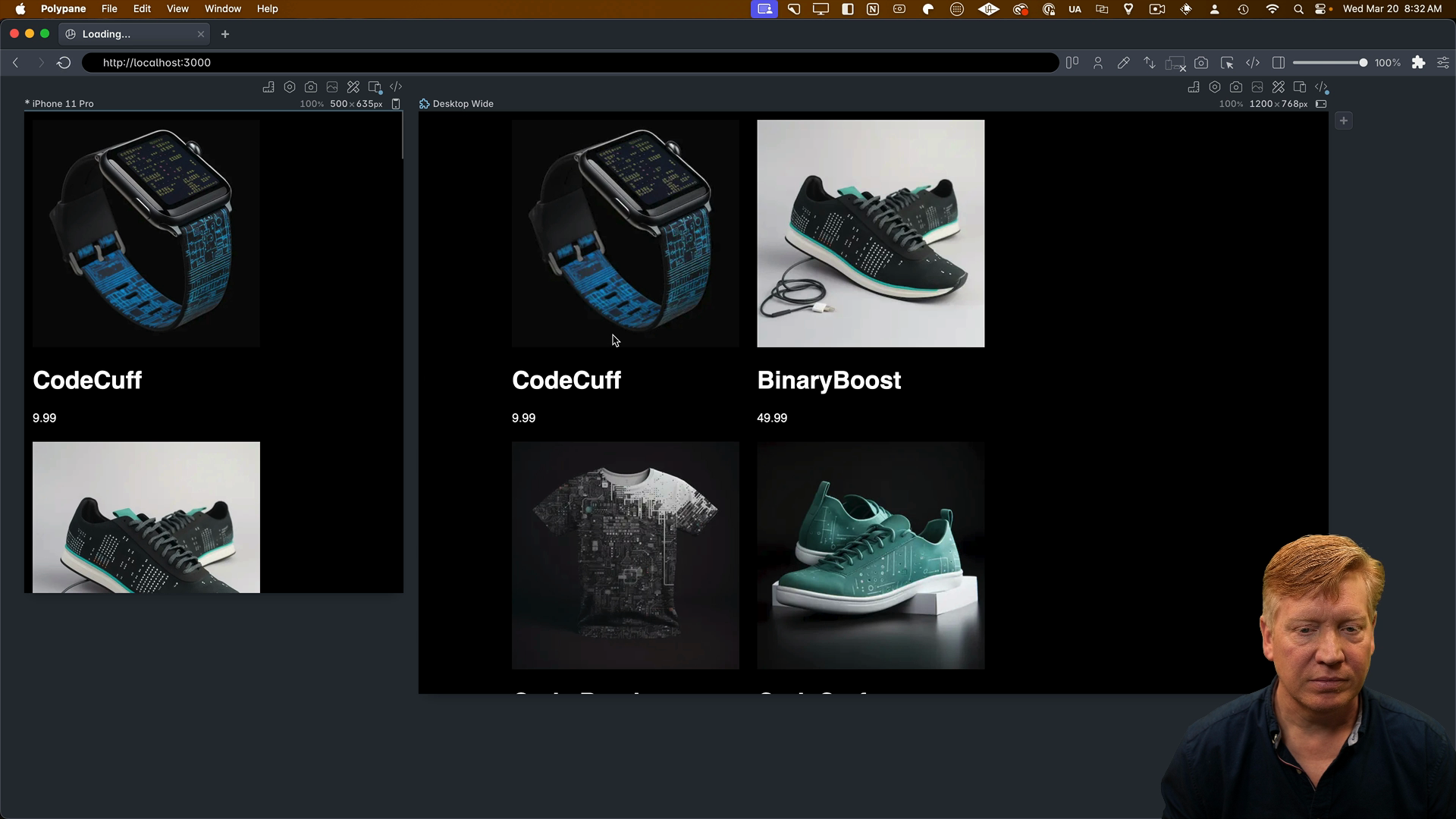
After saving, we'll see a two-column layout:

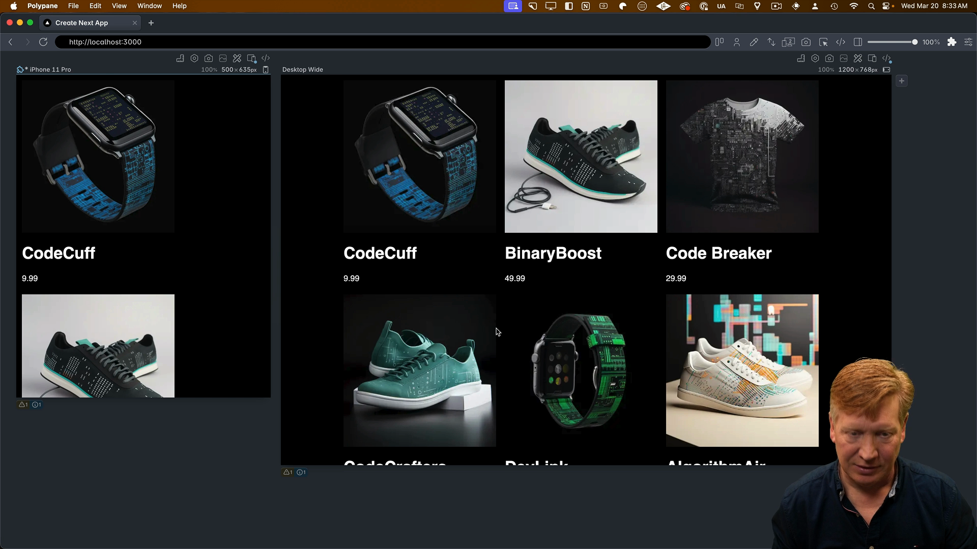
This indicates that we don't have a reset applied. Adding the reset to our global CSS will give us a nice three-card layout:
/* inside globals.css */
* {
  box-sizing: border-box;
  padding: 0;
  margin: 0;
}

With the layout fixed, we can move on to the ProductCard component.
Styling the Product Card
Inside of ProductCard.tsx we'll bring in the css and styled:
import { css, styled } from '@pigment/css';
Below that, we'll establish our vertical and horizontal container query selectors:
const VERTICAL = "@container (max-width: 450px)";
const HORIZONTAL = "@container (min-width: 450px)";
We'll create styled components for almost all of the parts of the ProductCard component. However, for the image we'll just create a class and apply it directly.
Here's how the styled divs will look:
const Card = styled("div")({
  containerType: "inline-size",
  width: "100%",
});

const CardContainer = styled("div")({
  display: "flex",
  width: "100%",
  flexDirection: "row",
  [VERTICAL]: {
    flexDirection: "column",
  },
});

const ImageContainer = styled("div")({
  width: "25%",
  [VERTICAL]: {
    width: "100%",
  },
});

const imageContainerImg = css({
  width: "100%",
  height: "auto",
  borderTopRightRadius: 0,
  [VERTICAL]: {
    borderTopRightRadius: "1rem",
  },
  borderTopLeftRadius: "1rem",
  borderBottomLeftRadius: 0,
  [HORIZONTAL]: {
    borderBottomLeftRadius: "1rem",
  },
});

const Title = styled("h1")({
  fontSize: "1.5rem",
  margin: "0",
  marginTop: "1rem",
});

const Price = styled("p")({
  fontSize: "1rem",
  marginBottom: "1rem",
  fontStyle: "italic",
});

const InfoContainer = styled("div")({
  width: "75%",
  paddingLeft: "1rem",

  borderColor: "#666",
  borderBottomWidth: 1,
  borderBottomStyle: "solid",

  borderRightWidth: 1,
  borderRightStyle: "solid",

  borderBottomRightRadius: "1rem",
  borderBottomLeftRadius: 0,
  borderTopRightRadius: 0,

  [VERTICAL]: {
    width: "100%",
    borderBottomLeftRadius: "1rem",
    borderLeftWidth: 1,
    borderLeftStyle: "solid",
  },
  [HORIZONTAL]: {
    borderTopRightRadius: "1rem",
    borderTopWidth: 1,
    borderTopStyle: "solid",
  },
});
Now we can apply the styled components to the ProductCard component:
export const ProductCard = ({ product }: Props) => {
  return (
    <Card>
      <CardContainer>
        <ImageContainer>
          <Image
            src={product.image}
            alt={product.title}
            width={300}
            height={300}
            className={imageContainerImg}
          />
        </ImageContainer>
        <InfoContainer>
          <Title>{product.title}</Title>
          <Price>{product.price}</Price>
        </InfoContainer>
      </CardContainer>
    </Card>
  );
};
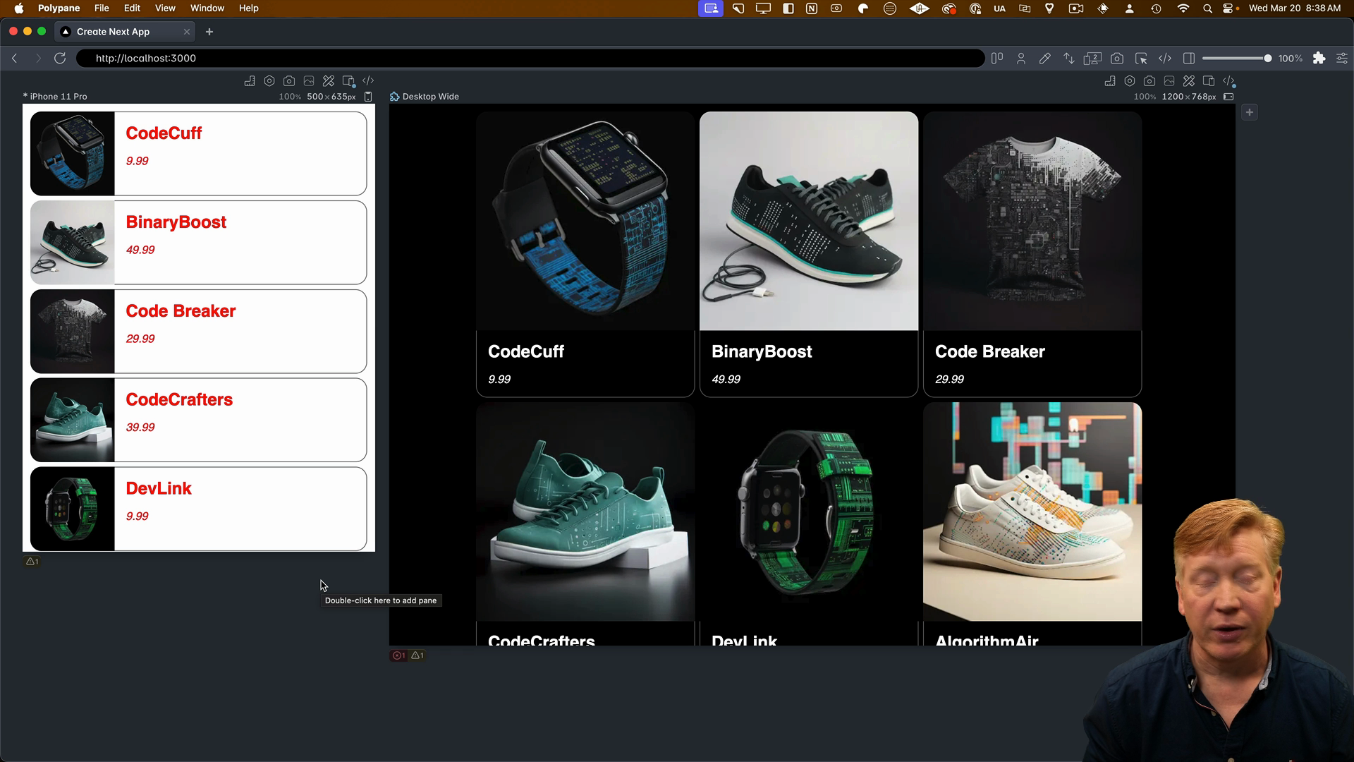
Notice how nicely the ProductCard component reads now that we've applied the styled components.
Normally we would end here since the example application has been styled, but it's worth taking a look at Pigment CSS's theming capabilities.
Adding a Theme to Pigment CSS
Inside of next.config.mjs, we can add a theme using the extendTheme function from Pigment's NextJS plugin:
// inside next.config.mjs
import { withPigment, extendTheme } from "@pigment-css/nextjs-plugin";
We'll update the export to specify a theme by calling the extendTheme function with an object for color schemes:
export default withPigment(nextConfig, {
  theme: extendTheme({
    colorSchemes: {
      light: {
        colors: {
          background: "white",
          foreground: "black",
        },
      },
      dark: {
        colors: {
          background: "black",
          foreground: "white",
        },
      },
    },
  }),
});
We get to define the schema for this theme, so we can use whatever symbols we want. What's really nice is that at build time, it's going to manage that theme for us.
Once the theme is established, we can apply it to the html element in the RootLayout component. We'll create a new htmlClass the uses the css function and destructures the theme object, applying the theme properties as appropriate:
// inside layout.tsx

const htmlClass = css(({ theme }) => ({
  backgroundColor: theme.colorSchemes.light.colors.background,
  color: theme.colorSchemes.light.colors.foreground,
  [DARK]: {
    backgroundColor: theme.colorSchemes.dark.colors.background,
    color: theme.colorSchemes.dark.colors.foreground,
  },
}));
After adding the htmlClass to the RootLayout class names, we can switch between light adn dark mode in Polypane. Changing colors in next.config.mjs will also update the theme:

TypeScript Configuration
There's one issue at this point, and that's TypeScript is showing several errors that won't pass checks for building and deploying.
To fix this, we'll do a little TypeScript hacking by defining types for Pigment.
Create a new file at the top level called pigment.d.ts, and add the following:
import { ExtendTheme } from "@pigment-css/react/theme";

declare module "@pigment-css/react/theme" {
  interface ThemeTokens {
    colorSchemes: {
      light: {
        colors: {
          background: string;
          foreground: string;
        };
      };
      dark: {
        colors: {
          background: string;
          foreground: string;
        };
      };
    };
  }

  interface ThemeArgs {
    theme: ExtendTheme<{
      colorScheme: "light" | "dark";
      tokens: ThemeTokens;
    }>;
  }
}
The extendTheme from Pigment CSS's React theme is now being extended to add types that match what we specified in next.config.mjs. Add the pigment.d.ts file to the tsconfig.json, and the TypeScript errors will be resolved:
// inside tsconfig.json
...
  "include": [
    "pigment.d.ts",
    "next-env.d.ts",
    "**/*.ts",
    "**/*.tsx",
    ".next/types/**/*.ts"
  ],
...
Similarities to Material UI
If you've used Material UI, a lot of this is going to look very familiar to you. The way you specify classes and use style is all the same as what you get with Material UI version 5.
The team designed it this way in order to more easily port between the Emotion system they had before and what they'll have with a subsequent versions of Material UI built on top of Pigment CSS.
It's also cool that Pigment CSS looks to be compatible with other frameworks as well. That means you could potentially create design tokens and classes using Pigment CSS that are transportable amongst all of the different view libraries. Great stuff!