Finish Styling with StyleX
 Jack Herrington
Let's apply the classes we defined in our StyleXCreate to our card:
export default function Home() {
  return (
    <main {...stylex.props(s.main)}>
      {PRODUCTS.map((product) => (
        <div key={product.id} {...stylex.props(s.card)}>
          <ProductCard product={product} />
        </div>
      ))}
    </main>
  );
}
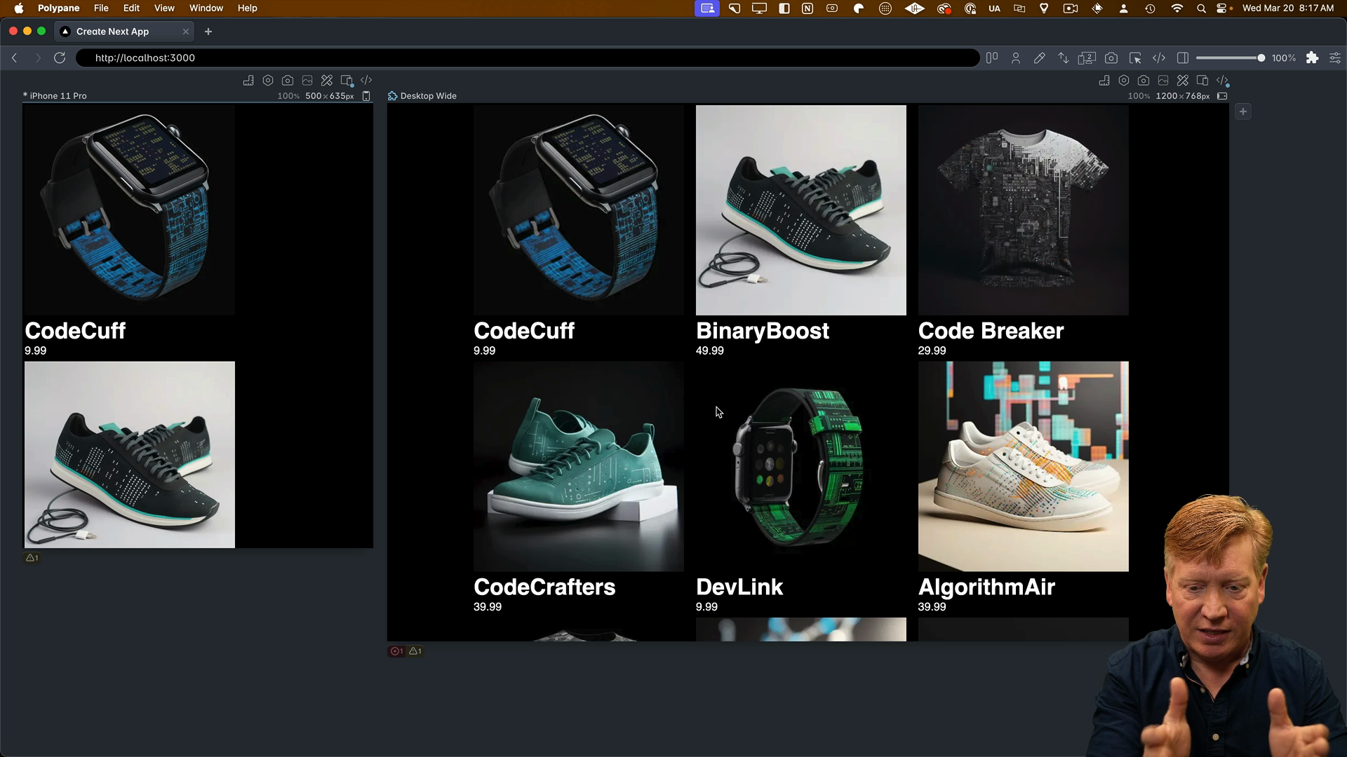
After making these changes, our layout is starting to take shape with a nice 3-card Monty layout.
Styling the Product Card
Now let's tackle the styling of our ProductCard component. As before, we'll import the StyleX library and define our container queries for both vertical and horizontal orientations:
// inside ProductCard.tsx
import * as stylex from "@stylexjs/stylex";

// ... at the bottom of the file:

const SMALL = "@container (max-width: 450px)";
const LARGE = "@container (min-width: 450px)";
Then, we'll create all the necessary classes for our product card. You might notice that many of these classes look similar to what we've seen before, but as your styling becomes more complex, the amount of CSS required increases.
One unique aspect of StyleX is that it doesn't allow the use of handy helpers like you might be used to for properties like border. Instead of using shorthand like border: 1px solid, StyleX requires granular control over each part of the style. This means you'll need to define the borderBottomWidth, borderBottomColor, and borderBottomStyle separately.
Here's the full set of styles:
const s = stylex.create({
  card: {
    containerType: "inline-size",
    width: "100%",
  },
  cardContainer: {
    display: "flex",
    width: "100%",
    flexDirection: {
      default: "row",
      [SMALL]: "column",
    },
  },
  imageContainer: {
    width: {
      default: "25%",
      [SMALL]: "100%",
    },
  },
  imageContainerImg: {
    width: "100%",
    height: "auto",
    borderTopRightRadius: {
      default: 0,
      [SMALL]: "1rem",
    },
    borderTopLeftRadius: "1rem",
    borderBottomLeftRadius: {
      default: 0,
      [LARGE]: "1rem",
    },
  },
  infoContainer: {
    width: {
      default: "75%",
      [SMALL]: "100%",
    },

    paddingLeft: "1rem",

    borderBottomWidth: 1,
    borderBottomColor: "#666",
    borderBottomStyle: "solid",

    borderRightWidth: 1,
    borderRightColor: "#666",
    borderRightStyle: "solid",

    borderBottomRightRadius: "1rem",
    borderBottomLeftRadius: {
      default: 0,
      [SMALL]: "1rem",
    },
    borderTopRightRadius: {
      default: 0,
      [LARGE]: "1rem",
    },

    borderTopWidth: {
      default: "inherit",
      [LARGE]: 1,
    },
    borderTopColor: {
      default: "inherit",
      [LARGE]: "#666",
    },
    borderTopStyle: {
      default: "inherit",
      [LARGE]: "solid",
    },

    borderLeftWidth: {
      default: "inherit",
      [SMALL]: 1,
    },
    borderLeftColor: {
      default: "inherit",
      [SMALL]: "#666",
    },
    borderLeftStyle: {
      default: "inherit",
      [SMALL]: "solid",
    },
  },
  title: {
    fontSize: "1.5rem",
    margin: "0",
    marginTop: "1rem",
  },
  price: {
    fontSize: "1rem",
    marginBottom: "1rem",
    fontStyle: "italic",
  },
});
const styles = StyleXCreate({
  card: {
    // ...
    borderBottomWidth: '1px',
    borderBottomColor: 'var(--border-color)',
    borderBottomStyle: 'solid',
    // ...
  },
});
This level of control can lead to more verbose CSS definitions, but it's part of what makes StyleX unique.
Applying the Styles
With our classes defined, let's apply them to the corresponding tags in our JSX:
export const ProductCard = ({ product }: Props) => {
  return (
    <div {...stylex.props(s.card)}>
      <div {...stylex.props(s.cardContainer)}>
        <div {...stylex.props(s.imageContainer)}>
          <Image
            src={product.image}
            alt={product.title}
            width={300}
            height={300}
            {...stylex.props(s.imageContainerImg)}
          />
        </div>
        <div {...stylex.props(s.infoContainer)}>
          <h1 {...stylex.props(s.title)}>{product.title}</h1>
          <p {...stylex.props(s.price)}>{product.price}</p>
        </div>
      </div>
    </div>
  );
};
After hitting save, we'll see the styled set of cards as expected.
When to Use StyleX
Looking back at the code for this example project, it's important to note that this example isn't necessarily showcasing StyleX at its best. StyleX is designed for creating precisely controlled design systems, which is particularly useful for large companies like Meta.
In those environments, you want a reliable design system with constraints. You might want to limit the modifications users can make to specific parts of a design element, like a button. StyleX allows you to define exactly which attributes of a button can be changed, which is a unique feature not found in other CSS libraries.
If you're working on a design infrastructure team at a large company or on an open-source project where you want to define a controlled design system for third-party contributors, StyleX is definitely worth considering.
However, developers coming from a CSS Modules or Tailwind background might find StyleX to be overly restrictive, like a "CSS straitjacket." But in larger environments, that level of control is often necessary.