ProNextJS
    Loading
    lesson

    Refine the Layout with CSS Modules

    Jack HerringtonJack Herrington

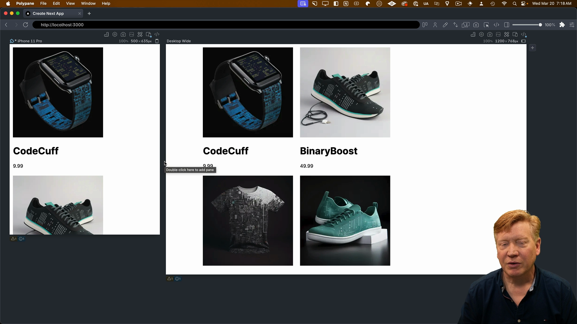
    Let's start by adding a className to our card and specifying styles.card to the div surrounding the ProductCard component:

    <main className={styles.main}>
      {PRODUCTS.map((product) => (
        <div key={product.id} className={styles.card}>
          <ProductCard {...product} />
        </div>
      ))}
    </main>
    

    After saving, we can see that we get a two-column layout with some nice padding, making it look more like a card.

    Card padding

    However, we don't have a CSS reset in place, which means there are some default CSS styles that aren't doing us any favors when it comes to box sizing.

    Add a CSS Reset

    To fix this, let's add a simple reset inside of the globals.css file. This reset sets the box-sizing to border-box and establishes basic defaults for img elements:

    *,
    *::before,
    *::after {
      box-sizing: border-box;
    }
    img {
      max-width: 100%;
      display: block;
    }
    

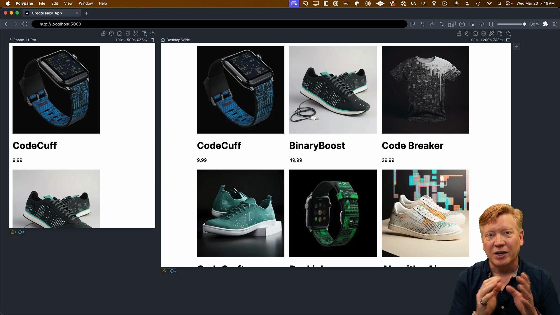
    There are larger resets available, but this one will work well for our application.

    With the reset in place, we now have a nice three-column layout that's starting to look really good.

    3 Columns after the CSS Reset

    Making Cards Responsive with Container Queries

    Next, we're going to focus on making our cards inherently responsive using container queries. We'll also give the cards rounded edges for a polished look.

    The component that manages the cards is ProductCard, so we will create a corresponding ProductCard.module.css file to style it.

    Looking at the structure of the ProductCard, we have a series of nested div elements. The top-level div will be our container, specifying that it's the container for the card in a container query system.

    export const ProductCard = ({ product }: Props) => {
      return (
        <div>
          <div>
            <div>
              <Image
                src={product.image}
                alt={product.title}
                width={300}
                height={300}
              />
            </div>
            <div>
              <h1>{product.title}</h1>
              <p>{product.price}</p>
            </div>
          </div>
        </div>
      );
    };
    

    Container queries are a powerful feature that allows you to create layouts dependent on the size of the container, similar to media queries, but instead of being based on the viewport size, they're based on the specified container.

    Inside of the the new ProductCard.module.css file, we'll establish the card class and set the container-type to inline-size:

    .card {
      container-type: inline-size;
    }
    

    Back in the component, we'll import the styles from ProductCard.module.css and apply the card class to the top-level div:

    // inside ProductCard.tsx
    import styles from './ProductCard.module.css';
    
    export const ProductCard = ({ product }: Props) => {
      return (
        <div className={styles.card}>
          <div>
            ...
    

    At this point, we won't see any visible difference because we're just establishing the card as a container. In order to have visible changes there's more work to do.

    Using Flexbox for Layout

    Inside the ProductCard, we have a nested div system. The top-level div contains two nested divs: the image div and the info div, which holds the title and price.

    We're going to use Flexbox to control the layout. In the vertical mode, we'll set it to a flex-column, and in the horizontal mode where the image is on the left and the info is on the right, we'll set it to a flex-row, which is the default.

    Let's create a cardContainer class, which will always use flex:

    /* inside ProductCard.module.css */
    .cardContainer {
      display: flex;
    }
    

    In the vertical layout mode (when the container width is less than or equal to 600px), we'll set the flex-direction to column. For the horizontal layout, we'll keep the default row format so its container query will remain empty for now:

    /* inside ProductCard.module.css */
    
    /* Vertical layout */
    @container (max-width: 450px) {
      .cardContainer {
        flex-direction: column;
      }
    }
    
    /* Horizontal layout */
    @container (min-width: 450px) {
    }
    

    Back in the component, we'll apply the cardContainer class to the outer div:

    export const ProductCard = ({ product }: Props) => {
      return (
        <div className={styles.card}>
          <div className={styles.cardContainer}>
            <div>
              <Image
                src={product.image}
                alt={product.title}
                width={300}
                height={300}
              />
            </div>
          ...
    

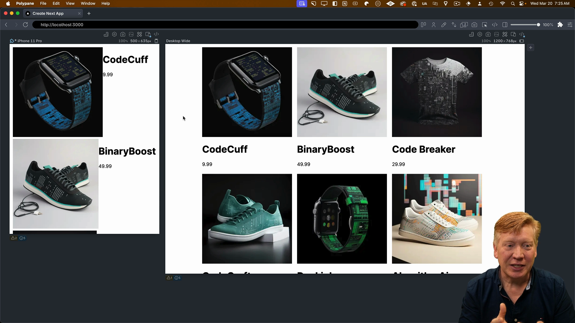
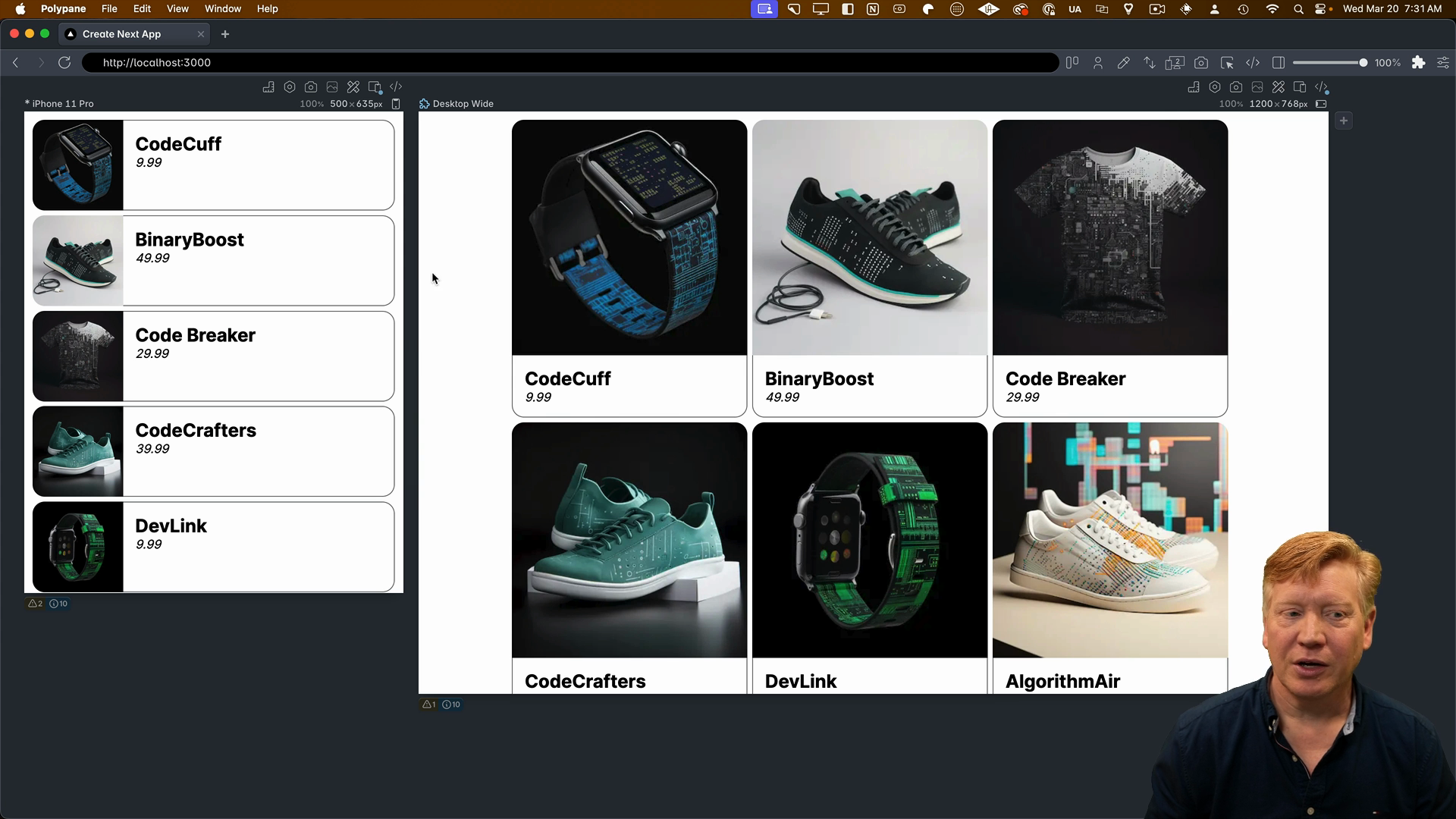
    After saving, we can see that in small sizes, we have a horizontal layout, and in large sizes, we have a vertical layout. It's looking good!

    Layout progress

    Next, we'll fix the image and make it responsive.

    Creating a Responsive Image

    Back in the CSS file, we need to create an imageContainer class for the nested div around the img tag.

    We'll start by specifying that the img inside the imageContainer is responsive by setting the width to 100% and the height to auto.

    In the vertical layout, the imageContainer will take up 100% width and have rounded corners on the top-left and top-right.

    In the horizontal layout, the imageContainer will take up 25% of the horizontal space, and the img will have rounded corners on the top-left and bottom-left:

    /* inside ProductCard.module.css */
    
    /* ...other classes as before... */
    
    .imageContainer img {
      width: 100%;
      height: auto;
    }
    
    /* Vertical layout */
    @container (max-width: 450px) {
      .cardContainer {
        flex-direction: column;
      }
    
      .imageContainer {
        width: 100%;
      }
    
      .imageContainer img {
        border-top-right-radius: 1rem;
        border-top-left-radius: 1rem;
      }
    }
    
    /* Horizontal layout */
    @container (min-width: 450px) {
      .imageContainer {
        width: 25%;
      }
    
      .imageContainer img {
        border-top-left-radius: 1rem;
        border-bottom-left-radius: 1rem;
      }
    }
    

    Let's attach the imageContainer class to the div around the img:

    export const ProductCard = ({ product }: Props) => {
      return (
        <div className={styles.card}>
          <div className={styles.cardContainer}>
            <div className={styles.imageContainer}>
              <Image
                src={product.image}
                alt={product.title}
                width={300}
                height={300}
              />
            </div>
          ...
    

    After saving, the image looks great with the rounded corners in both layouts:

    Rounded image corners

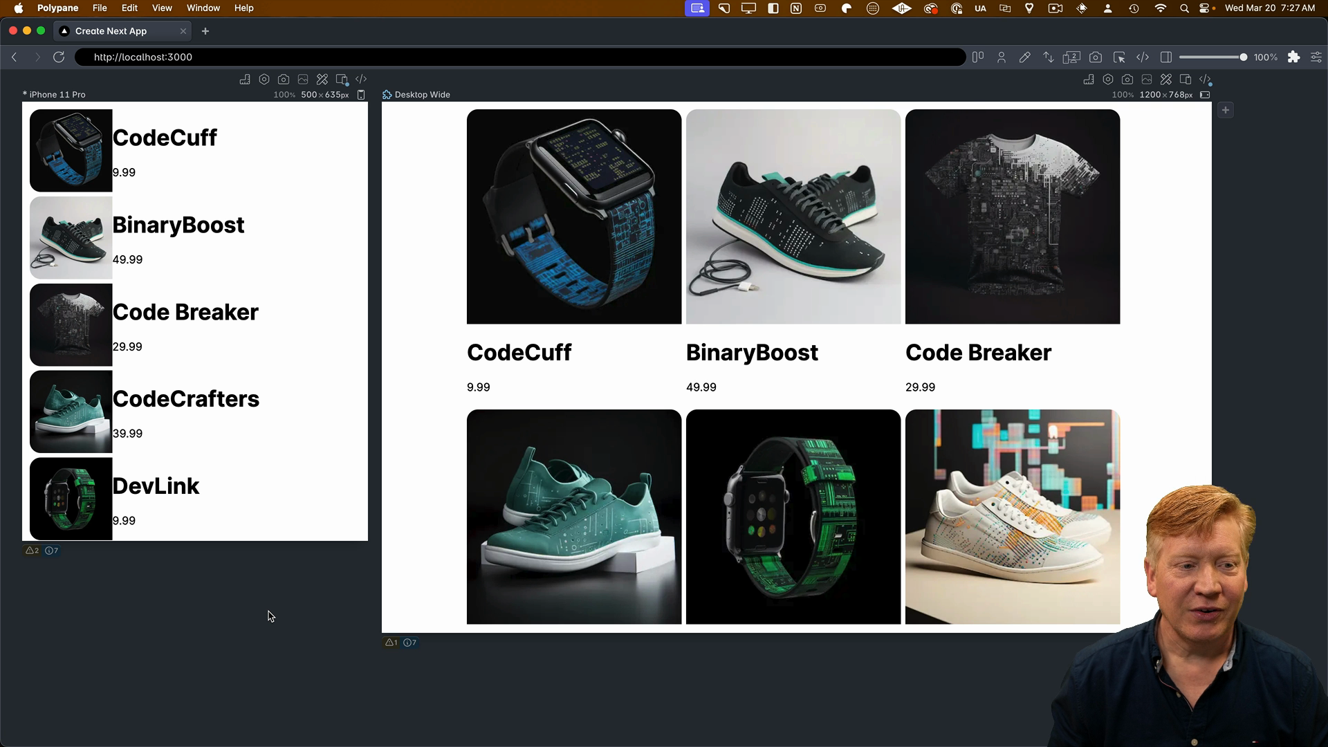
    However, the additional information could look better.

    Styling the Info Container

    The title and price are contained within a div that we'll call the infoContainer. It will add some padding to separate it from the image and give us a nice rounded border to define the card.

    Let's create the infoContainer class, which will have some padding-left to create space between the image and the info:

    .infoContainer {
      padding-left: 16px;
    }
    

    In the vertical layout, the infoContainer will take up 100% width and have rounded corners on the bottom-left and bottom-right.

    In the horizontal layout, the infoContainer will take up 75% width (since the image is 25%), and it will have rounded corners on the top-right, bottom-right, and bottom-left:

    /* Vertical layout */
    @container (max-width: 450px) {
      .cardContainer {
        flex-direction: column;
      }
    
      .imageContainer {
        width: 100%;
      }
    
      .imageContainer img {
        border-top-right-radius: 1rem;
        border-top-left-radius: 1rem;
      }
    
      .infoContainer {
        width: 100%;
        border-bottom: 1px solid #666;
        border-top: none;
        border-left: 1px solid #666;
        border-right: 1px solid #666;
        border-bottom-right-radius: 1rem;
        border-bottom-left-radius: 1rem;
      }
    }
    
    /* Horizontal layout */
    @container (min-width: 450px) {
      .imageContainer {
        width: 25%;
      }
    
      .imageContainer img {
        border-top-left-radius: 1rem;
        border-bottom-left-radius: 1rem;
      }
    
      .infoContainer {
        width: 75%;
        border-bottom: 1px solid #666;
        border-top: 1px solid #666;
        border-right: 1px solid #666;
        border-top-right-radius: 1rem;
        border-bottom-right-radius: 1rem;
      }
    }
    

    We can now attach the infoContainer class to the div around the title and price:

    export const ProductCard = ({ product }: Props) => {
      return (
        <div className={styles.card}>
          <div className={styles.cardContainer}>
            <div className={styles.imageContainer}>
              <Image
                src={product.image}
                alt={product.title}
                width={300}
                height={300}
              />
            </div>
            <div className={styles.infoContainer}>
              <h1>{product.title}</h3>
              <p>${product.price}</p>
            </div>
            ...
    

    Now, the card is looking great with the rounded borders around the info section:

    Vertical mode card

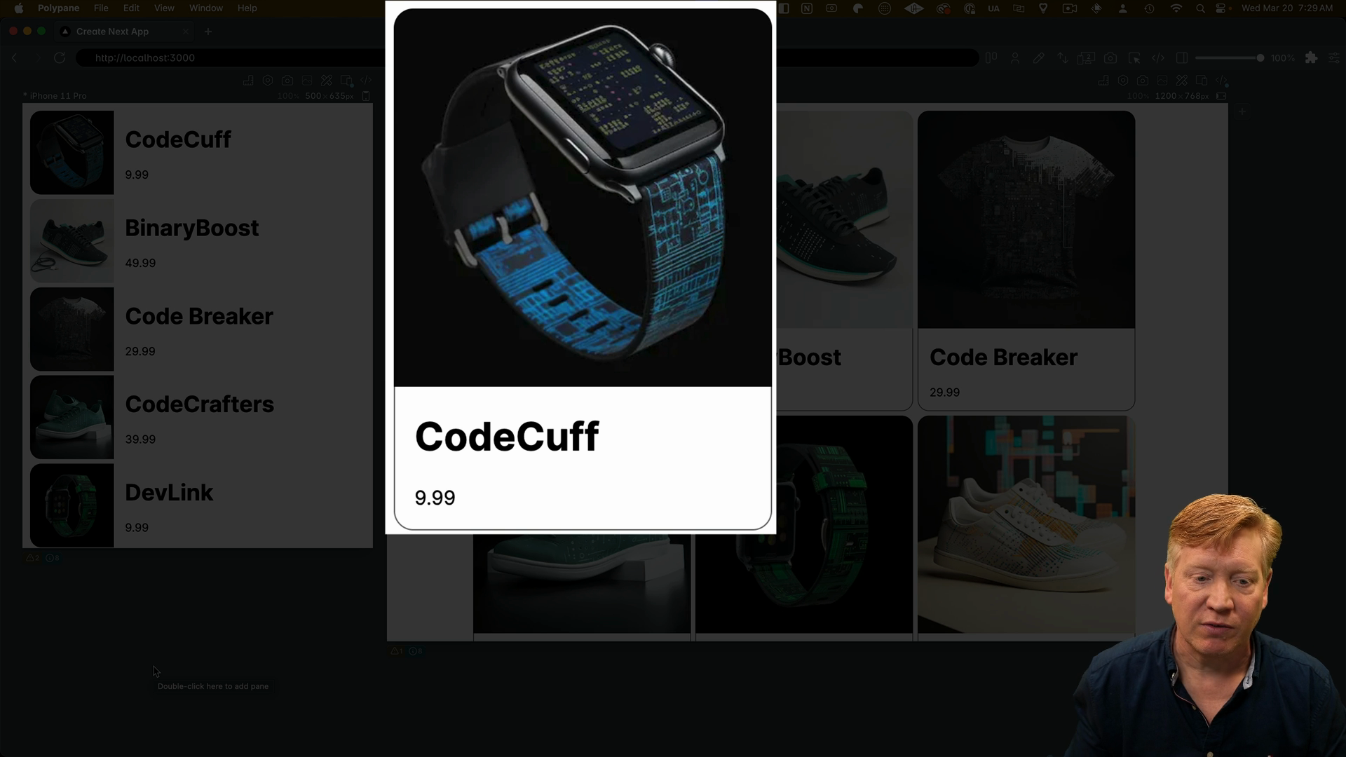
    Styling the Title and Price

    With the card layout looking good, let's clean up the formatting of the title and price by creating some classes for them. We'll add some font sizes and margins to make them look nicer:

    .title {
      font-size: 1.5rem;
      margin: 1rem 0 0 0;
    }
    
    .price {
      font-size: 1rem;
      font-style: italic;
      margin: 0 0 1rem 0;
    }
    

    Let's attach these classes to the respective elements:

    // inside the infoContainer div
    <h1 className={styles.title}>{title}</h3>
    <p className={styles.price}>${price}</p>
    

    With that, our card styling is complete!

    font styles applied

    Supporting Dark Mode

    The only thing left is to handle dark and light mode, which is a really easy fix.

    In globals.css, we can specify the default light mode styles:

    body {
      background-color: white;
      color: black;
    }
    

    Then, we can add a media query to flip the colors if the user prefers the dark color scheme:

    @media (prefers-color-scheme: dark) {
      body {
        background-color: black;
        color: white;
      }
    }
    

    Now, as we toggle between light and dark mode, we can see the card adapting accordingly.

    Dark mode enabled

    That's it! Using CSS modules makes styling a breeze. You create classes, import them, and it automatically handles the hashing of the class names. It's a predictable and reliable way to style your applications.

    By walking through the CSS step-by-step, hopefully you now understand not only how we used CSS modules but also how the application is laid out, the value of media queries and container queries, and how to implement light and dark mode.

    Please refer back to this video if you get confused about how we're attaching classes in other videos. The CSS itself will be exactly the same; we'll just be using different mechanisms for specifying that CSS.

    Transcript

    All right, so picking up where we left off, I'm going to go and add a class name, and then I'm going to specify styles.card. Hit save. Now, we can see that we get a two-column layout, but we do get some good padding, so it's starting to look like a card.

    Problem is that we don't have a CSS reset going on. There are some defaults in the CSS that are not doing us any favors when it comes to box sizing. So what I'm going to do is I'm going to add in the global CSS a reset. That reset is pretty simple. We're just basically setting the border sizing to

    border box and then we're setting some basic defaults on image. There are much larger resets out there, but this is the 1 that will work for our application. Now, we get our nice three-column layout, and it's starting to look really good. Next time, we're going to drill into our cards. We're going to make our cards inherently responsive internally by using container queries, and we're going to give them some roundy

    edges. It's going to look really nice. Now, the component that actually manages cards is product card. So what I'm going to do is I'm going to create a corresponding product card.module.css file, that's going to be used by the product card. Now, let's go take a look at the structure of the product

    card. Now the product card has a bunch of nested divs. Welcome to the web world circuit 2024. Div, div, div all the way down. Now that initial div at the top is going to be our container. It's going to specify that this is the container for the card in a

    container query system. Container queries are really cool. There are ways to do essentially a media query, so you're going to have layouts that are dependent on size, but instead of being dependent on the view size, it can be dependent on whatever the container is that you specified. So that top level div, we'll call it card, is going to

    specify that it is a container. To do that we establish a card class and we set the container type to inline size. When you do a container query, you basically are saying that I want to be relative to wherever the container is and it looks up the hierarchy or the tree of elements to find a

    container that has a specified container type. So that's how you specify the container. So let's go take our card. Now we're going to import styles again, sure, from that product card module CSS,

    and then we'll apply that card class to that div. Let's hit save, and we see no visible difference. We're not really doing anything at this point. We're basically just establishing that the card itself is a container. So let's look more visually at what we've got here. So inside of card we've got a

    nested div system. The top level div contains 2 nested divs. The top div is the image div and then the bottom div is the info div. That's where it's got the title and the price. And what we're going to

    do is this outside div is going to have a flex box. And in the vertical mode we're going to set that flex box to a flex column. And then in the horizontal mode where we got the image on the left and the info on the right, we're going to set it into a flex row mode, which actually turns out to be the

    default. So let's go and build out that card container class. So we're going to have a card container class. It's going to be in all cases a flexbox. But then in the vertical layout mode, we are going to say that the card container has a column-based format. Then in the horizontal layout, we're just going to keep it the same by

    default. That means it's going to give a row format. So let's save on that and we'll apply that class, the card container class, to our outside div. Let's save and see what we get. Alright, so this is starting to move in a good direction here. Now in the small sizes we've got our horizontal layout

    and then in large sizes we've got the vertical layout. That's really nice! Okay so let's now fix the image. So the nested div that we have around the image tag, we'll call that image container and let's create a class for that. So we're going to create an image container class, and then within that, we're going to have an image. So we're going

    to start off by just specifying that that image is going to be responsible. We'll set the width to 100 percent and the height to auto. That's going to give us a nice responsive image. Then in the vertical layout, we're going to say that the image container itself takes up 100 percent. So it's going to go from side to side inside the container.

    Then we're going to add some border radius to the top left and top right of the image. That's going to give us a nice rounded image. Let's go and take that image container now and attach it to the product

    card. Let's save. Awesome. Now in the vertical format, now we've got the nice roundy edges on the image. Let's go and fix our horizontal layout, which currently doesn't look so good. Over in the horizontal layout, we're going to say that the

    image container, which is now going to be laid out to the left-hand side, is only going to take up 25% of the total horizontal space. And then for border radiusing, we're going to have the top left and bottom left border radius. Let's hit save. And yeah, this is looking really good. Now we've got our border radiuses over there and those look really good. Unfortunately our info stuff kind of

    looks kind of janky. So let's go and fix our title and our price. So the title and price are contained within a div. We're gonna call that the info container div. It's gonna do a couple of things. It's gonna add a little padding for us that kind of brings it away from the image, but it's also going to give us a nice rounded border, so we create the definition of the card. To do that, we'll start by

    creating the InfoContainer class, give it a little padding on the left, and then for the vertical layout, we're again going to say that the InfoContainer takes up the entire width, and then we're going to establish a bunch of borders to give us the correct bordering around the left, right, and bottom. Now, let's see what that looks like. So

    we'll add that info container to our div, take a look over in PolyPane, and now, yeah. Now, yeah, we got a nice bordering around the info section of our card, and our card starts to look like an actual card. Now, let's fix our horizontal layout. To do that, we go back over in our product card. Now, in the horizontal mode, we're going to specify that

    we have a width of 75 percent because the image is 25 percent, 25 plus 75 percent equals 100 percent, and we're going to set up the top, right, and bottom borders. Hit save, and There we go. Now, I've got good looking cards in both modes. 1 last thing, title and price are not exactly well formatted. So

    let's go and create a few little classes to clean those up. So right here below info container, I'm going to add title and price. Let's save. Those will just go and set up some font sizes and some margins. Let's go and attach those to our element. So to the title, we'll attach the title class, and

    to the price, we'll attach the price class. Let's hit save, and There we go. Now, the only thing that we've got left is that we don't handle dark and light mode, and that's actually a really easy fix. So let's go back in our application, and let's support dark and light mode. So the way I'm going to

    choose to do that in this particular application is I'm going to go back over into global.css, and I specify that by default, we're going to go with the light mode in this case. So we're going to say that the body tag has a background of white and the color of the text is black. Then if the user prefers the color scheme of dark, we're going to just flip that around. The background color is going to go black

    and the color is going to go white. Let's hit save. And there we go. Now I personally like dark mode so that's why it's defaulting to dark mode. But you can go and specify whatever you want. And now as we change light and dark and we specify those, we can see that we get a good changing between light and dark mode. That's it. When it comes to styling the

    CSS modules, it really doesn't get much easier. You create some classes, you import them, it automatically does the hashing of the classes. It is a predictable and reliable mechanism to style your applications. I hope that in going through the CSS step-by-step, you understand not just how

    we did the CSS modules, but actually how this application is laid out, the value of media queries, the value of container queries, and how to do light and dark mode. Please refer back to this video if in other videos you get confused about how we are attaching these classes. We're going to do

    the CSS itself exactly the same in every 1 of them. We're just going to use different mechanisms for specifying that CSS.