In this section of the tutorial, we're going to focus on CSS modules. CSS modules are baked into Next.js, and if you just want to do CSS, CSS modules are the way to do it.
A Preview of the Final Result
As we go through this example, this is what we're going to be looking for in terms of the final result:
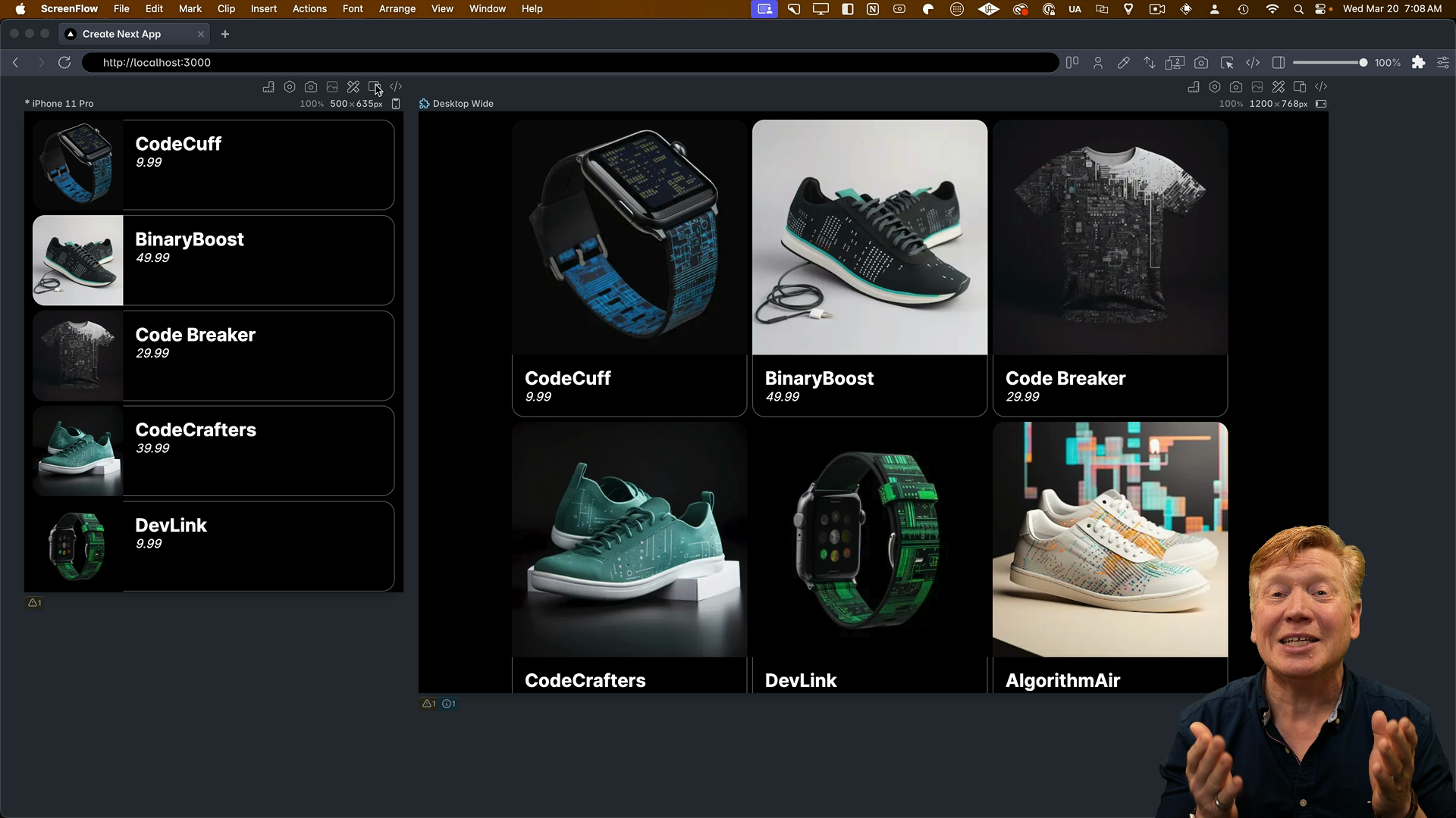
We can see that we've got a dark mode view of both the mobile size and the desktop size. A commercial application called Polypane is used here to look at multiple sizes simultaneously, as well as toggling dark mode. However, you can use any browser you like.
Let's start working on the CSS that gets us to the final result.
Starting the Development Server
Start the development server by running:
pnpm dev
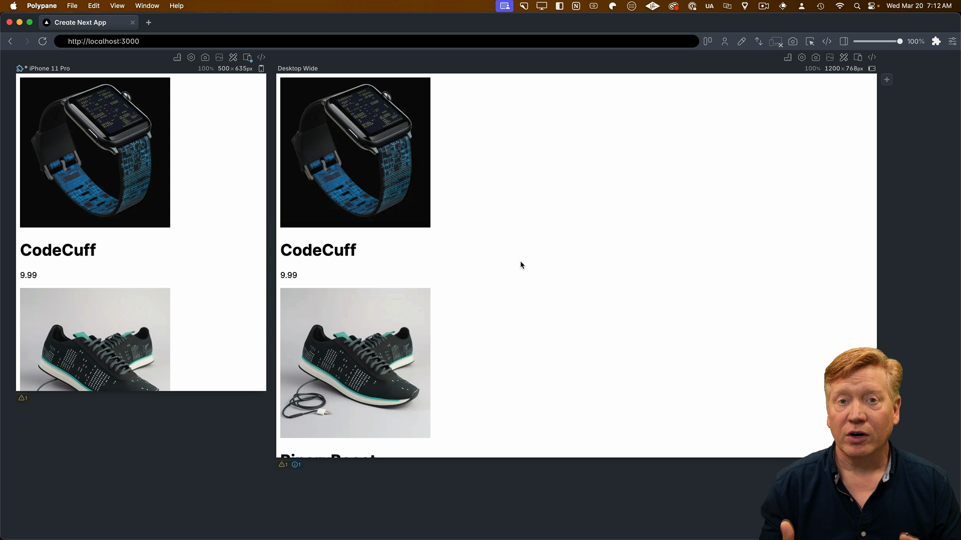
You should see the completely unstyled application:
Back in VS Code, we'll start building out the CSS layout.
Constraining the Page Width
The first thing we want to do is constrain the width of the page and then move it in from the sides. We want to set a boundary of 960 pixels and then adjust it from the sides.
To do that, we're going to create a new file inside of src/app called page.module.css to specify a CSS module. Anything inside of this file is going to be CSS and will be usable as a CSS module.
Inside of the file, we'll create a CSS class like you normally would in any CSS file. We'll call it main:
/* inside of page.module.css */
.main {
  max-width: 960px;
  margin: 0 auto;
}
Now in the page.tsx file, we'll import the styles:
// inside page.tsx

import styles from './page.module.css';
Then, to use the main class from the styles, we simply use className and set it to styles.main:
// inside the Home component
<main className={styles.main}>
The underlying CSS modules mechanism baked into Next.js is going to take that CSS from the CSS file, then statically generate it into a CSS file that is then associated with the application.
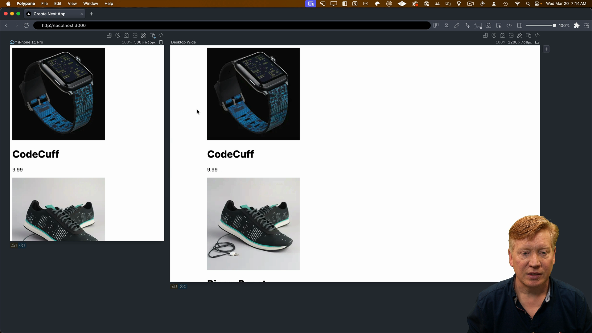
After saving our work, we can see in Polypane that it brought the content in from the sides a little bit. The effect is subtle, but it's there.
Looking in browser DevTools, notice how class names include a hash similar to this:
<body class="__className_aaf875">
The cool thing about CSS modules is that the generated CSS gives you good encapsulation, meaning you can have the same class name in multiple components without collisions.
Creating a Three-Column Layout
The next thing to do is create a three-column layout for the desktop mode. We're going to use Flexbox for that, and main is going to control that as well.
Back in the page.module.css file, set the display mode to flex:
.main {
  max-width: 960px;
  margin: 0 auto;
  display: flex;
}
Now we've got a Flexbox, it's a flex row, but it's continuing on ad infinitum:
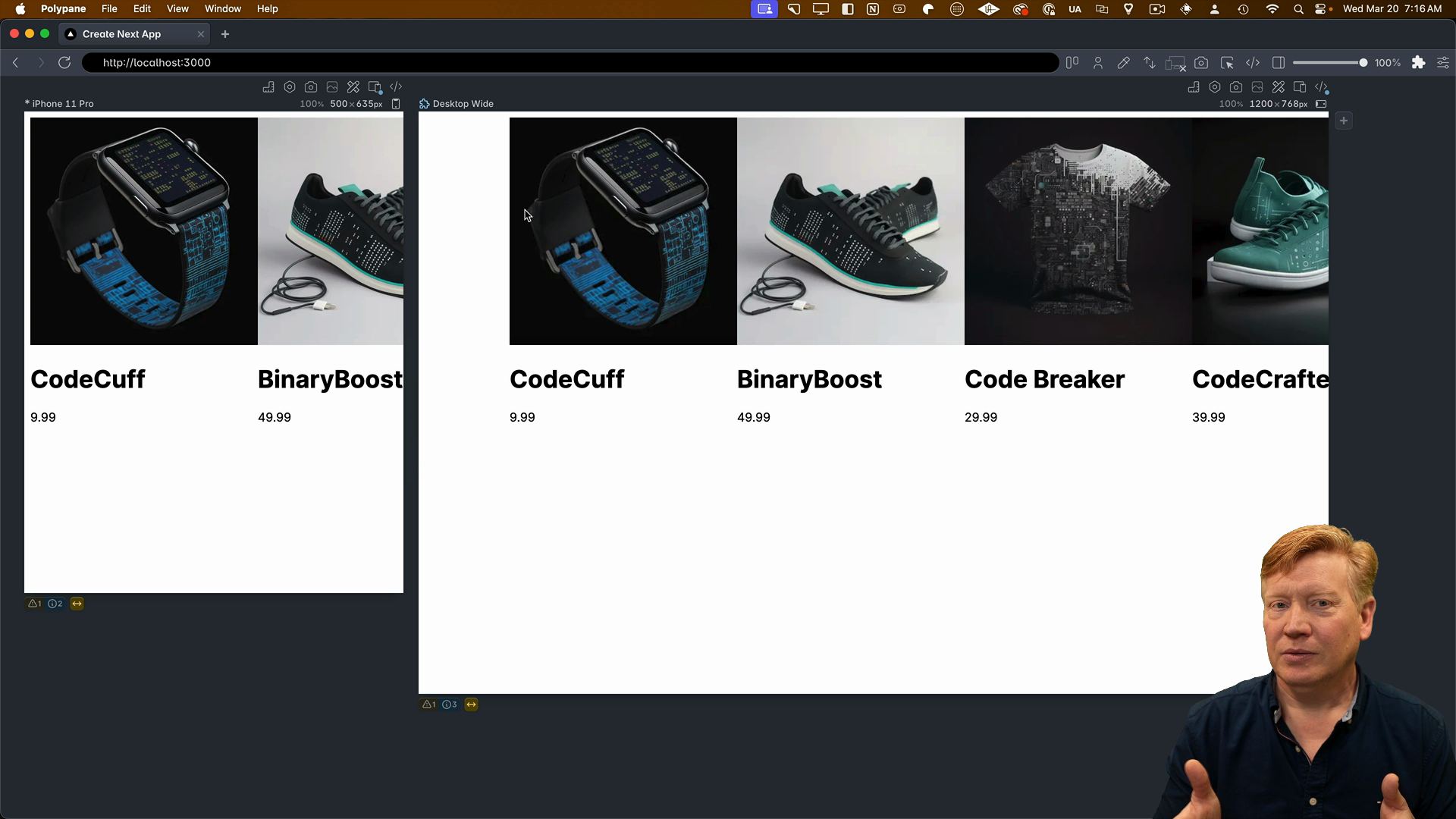
That's not good. We need to tell it to wrap when it reaches the edge of the container. To do that, we specify flex-wrap and set the mode to wrap:
.main {
  max-width: 960px;
  margin: 0 auto;
  display: flex;
  flex-wrap: wrap;
}
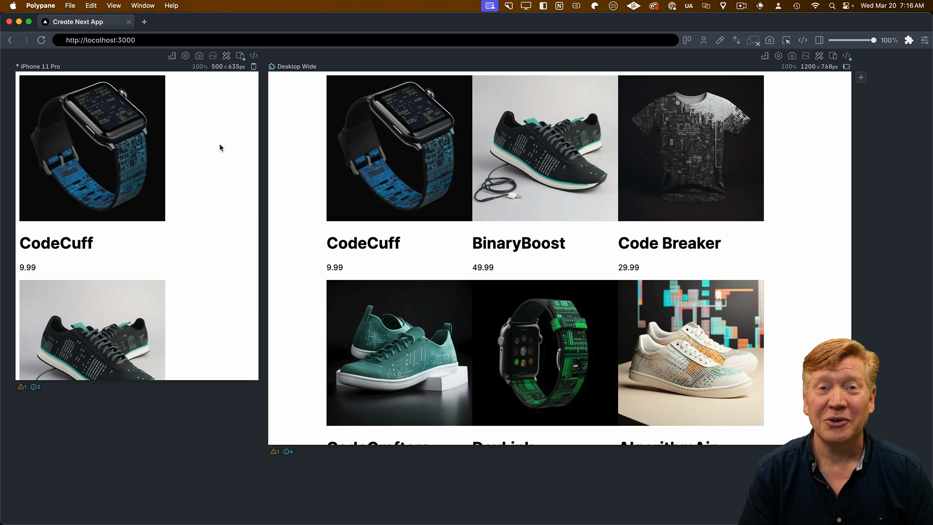
After saving, it's starting to look like a decent layout:
Styling the Product Card
The next thing to do is start styling the card.
Inside of the page.module.css file we'll add a card class and some media queries:
.card {
  padding: 0.2rem;
}

@media screen and (max-width: 768px) {
  .card {
    width: 100%;
  }
}

@media screen and (min-width: 768px) {
  .card {
    width: 33%;
  }
}
Your task is to apply the card class to the <div> that wraps the product card in the Home component in the page.tsx.
In the next lesson, we'll pick up from there.