Getting Started with Tailwind CSS
Let's take a look at how we can use Tailwind to transform our site's unstyled column layout, which is currently not responsive or themeable in light and dark mode, into a fully-fledged, well-laid-out application.
Installing Tailwind
First, we'll need to install Tailwind. Instructions for installation with Next.js can be found in the Tailwind CSS docs, but we'll work through the steps here as well.
Let's start by navigating to the tailwind-version directory of the repo.
Using PNPM (or NPM or Yarn if you prefer), we'll install tailwindcss, postcss, and autoprefixer:
pnpm add -D tailwindcss postcss autoprefixer
These is for Tailwind version 3. In Tailwind version 4, which is currently in beta, you will only need to install tailwindcss. The new Oxide engine in Tailwind 4 takes care of PostCSS and auto-prefixing, and it's built-in. It's also 10 times faster, which is pretty cool.
After the installation, we need to initialize our Tailwind config:
npx tailwindcss init -p
This command creates a PostCSS config and a Tailwind config.
Configuring Tailwind
Since all of our code is in the src directory, we only need to modify the content section of the tailwind.config.js file:
// tailwind.config.js
module.exports = {
  content: [
    "./src/**/*.{js,ts,jsx,tsx,mdx}",
  ],
  theme: {
    extend: {},
  },
  plugins: [],
};
Again, in Tailwind 4, you won't need to do this. It automatically detects your code anywhere in your project tree.
Adding Tailwind to Global CSS
The last step in the configuration is to add Tailwind to our global CSS. In the src/globals.css file, add the following:
@tailwind base;
@tailwind components;
@tailwind utilities;
In Tailwind 4, you'll use an import statement instead: import 'tailwindcss/tailwind.css';.
Checking the Setup
Start the application by running:
pnpm dev
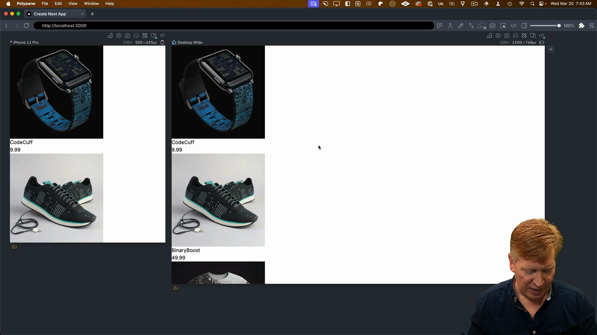
Here's how it should look:

We can see that Tailwind has done a bit of a reset for us. The h1 font size is smaller, and we've lost the margins and padding. Everything is kind of reset.
Adding Dark Mode
Let's start building out our CSS layout by handling dark mode and light mode switching.
In the layout.tsx file, add the dark:bg-black and dark:text-white classes to the body tag:
<body className={`${inter.className} dark:bg-black dark:text-white`}>
  {/* ... */}
</body>
This sets a white background and black text in light mode, and a black background with white text in dark mode.
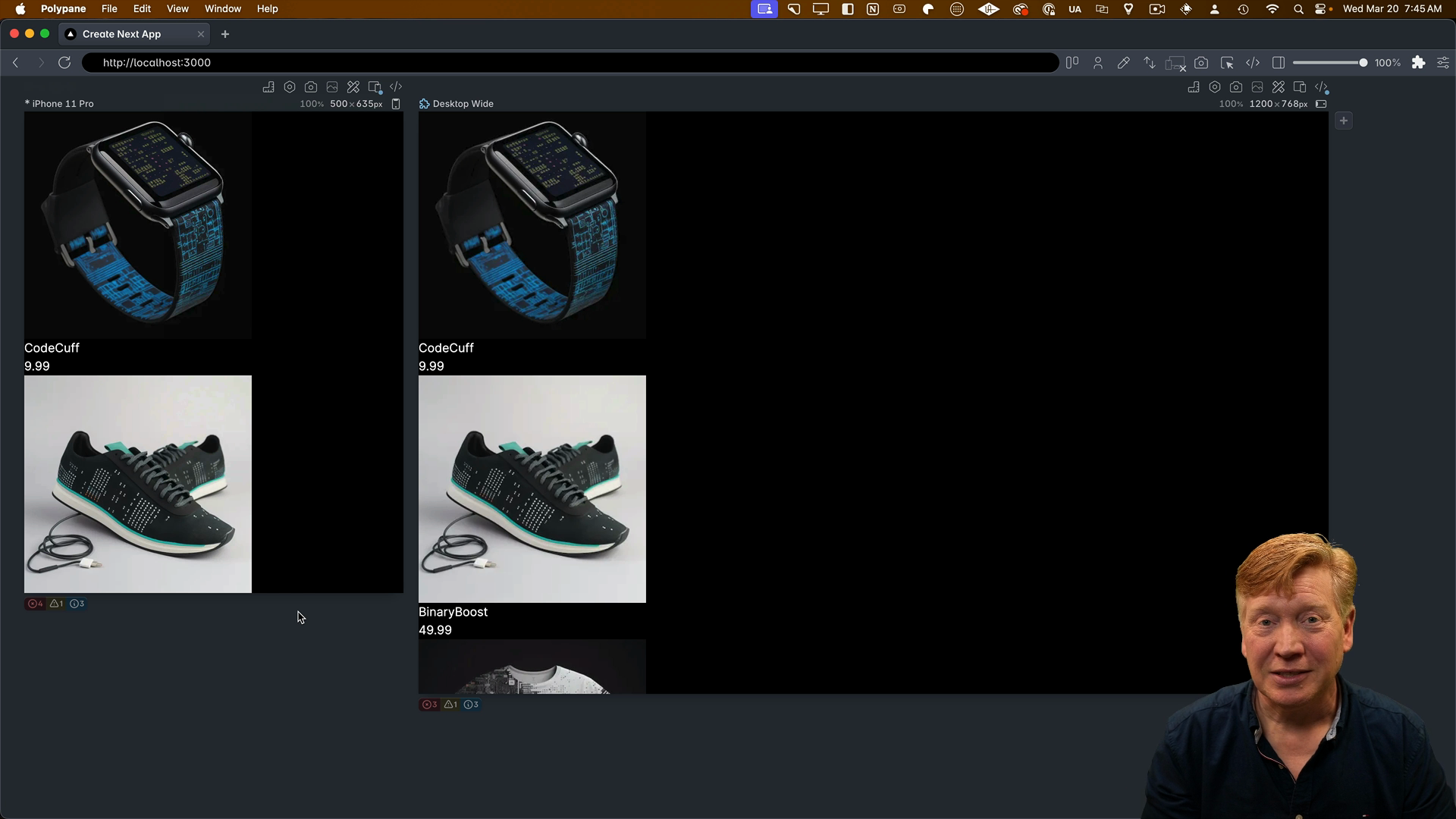
Saving the file, we can see in Polypane that it automatically applies the dark mode styles since that's set as its default:

Toggling between light and dark mode works perfectly. It's really easy to handle dark mode and light mode with Tailwind.
Challenge: Set Up the Page Layout
The next step is to set up the layout for the page itself, which includes a 3-column layout.
To do this, you'll need to update the page.tsx file to add appropriate classes to the main tag as well as the div used to create cards:
// inside page.tsx

<main>
  {PRODUCTS.map((product)) => {
    return (
      <div key={product.id}>
        <ProductCard product={product} />
      </div>
    );
  }}
</main>
The ProductCard.tsx file will also need classes added.
The classes you'll need in no particular order are:
flex-wrap@containermd:w-1/3max-w-[960px]w-fullh-automx-autoflexp-2rounded
Refer to the CSS Modules section and cross-reference the Tailwind docs to figure out which classes to apply where.
For additional reading, check out the tailwind-container-queries repo on Github as well as the docs on responsive design in Tailwind.
In the next lesson, we'll go through which classes to apply to which elements to create the 3-column layout.